
This guide will show you how to use the Spend Mix Analysis feature within sales-i. This feature allows you to view how much a company is spending in a product area against your market averages, enabling you to view potential sales opportunities.
Desktop
Download a PDF Version
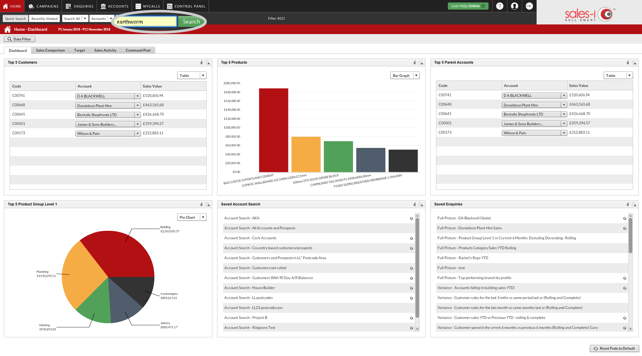
Step 1: Use the Quick Search
Use the Quick Search bar to find the account you would like to view and click the green Search button.
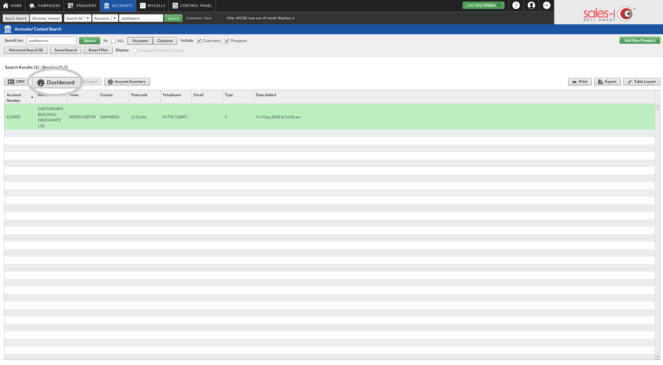
Step 2: Click Dashboard
Select the account you would like to view so that they turn green and click Dashboard.
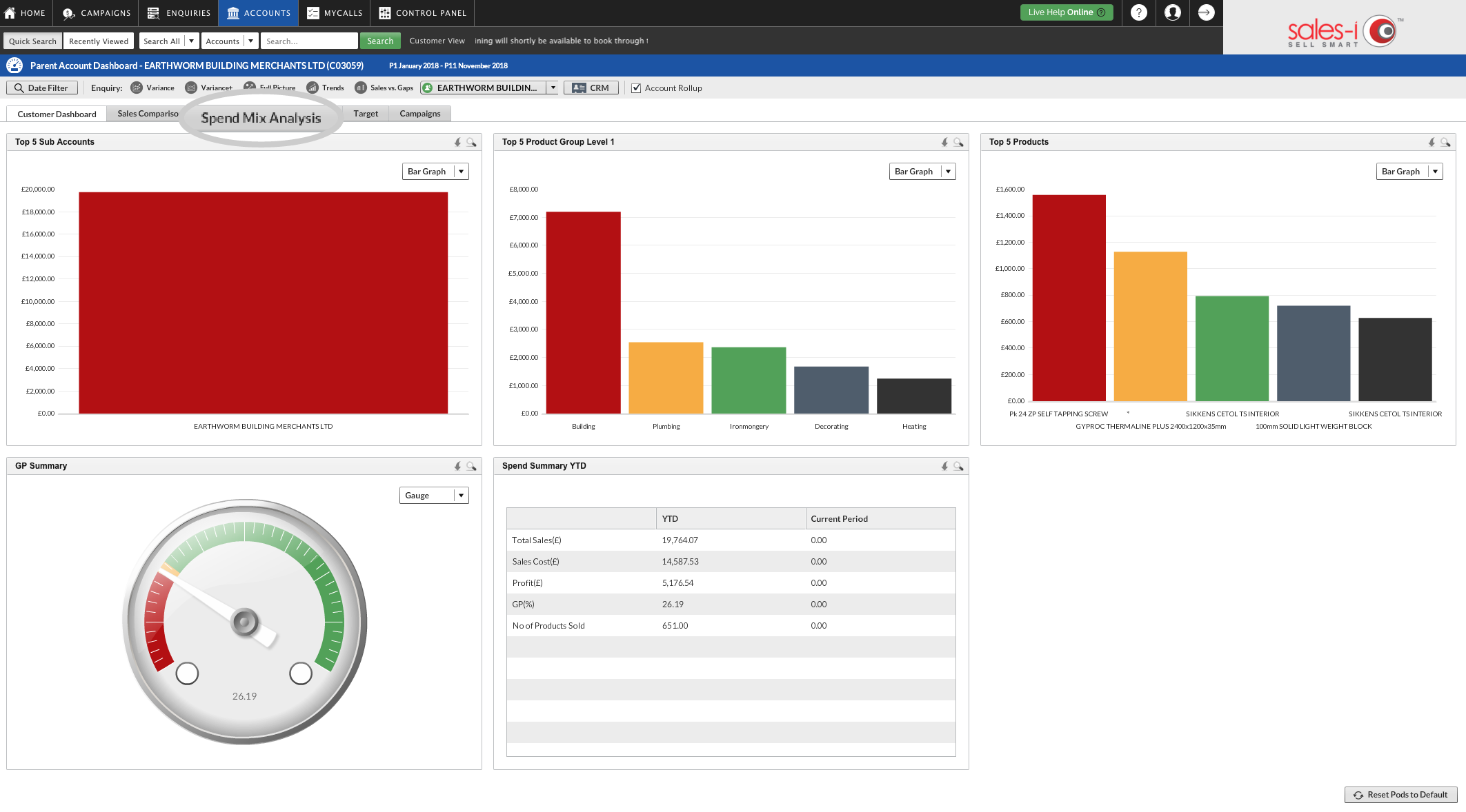
Step 3: Click Spend Mix Analysis
The companies dashboard will now appear showing different information about your chosen account.
To view the companies Spend Mix Analysis. Click the Spend Mix Analysis tab.
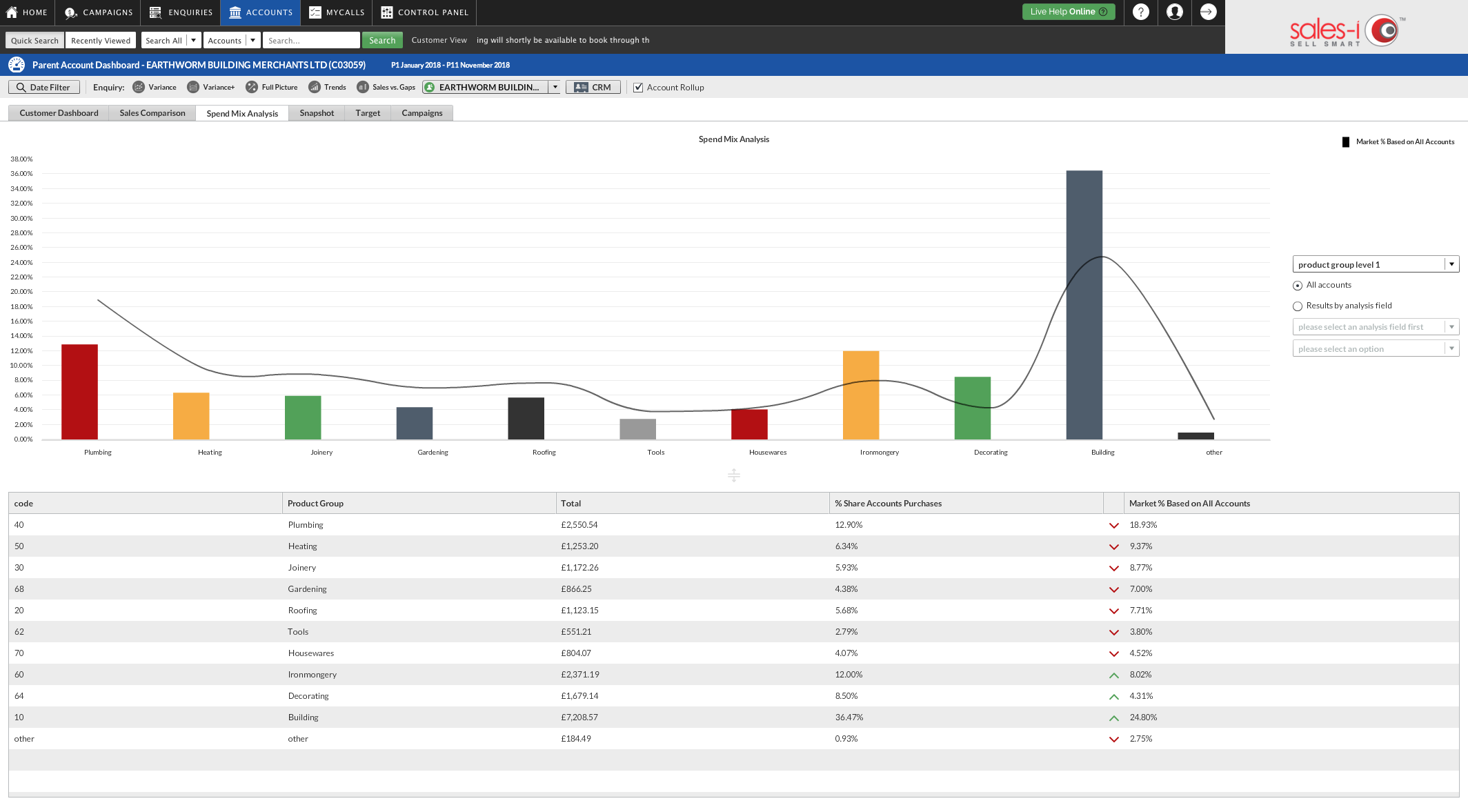
Step 4: Spend Mix Analysis explained
You will now see a Spend Mix Analysis chart and below that a table. The bar shows the amount spent YTD by your selected company on that particular Product Group. The line shows the Market Average.
The Market Average is the average of all of your accounts in sales-i that have spent money in your selected Product Group e.g. Plumbing and shows whether your selected company has spent more or less against this average.
If the table below shows a red downwards arrow for any Product Group, this could be an area for your sales rep to push sales in for that customer.
*Please Note: You can change the analysis dates by selecting Date Filter on the top left hand side.
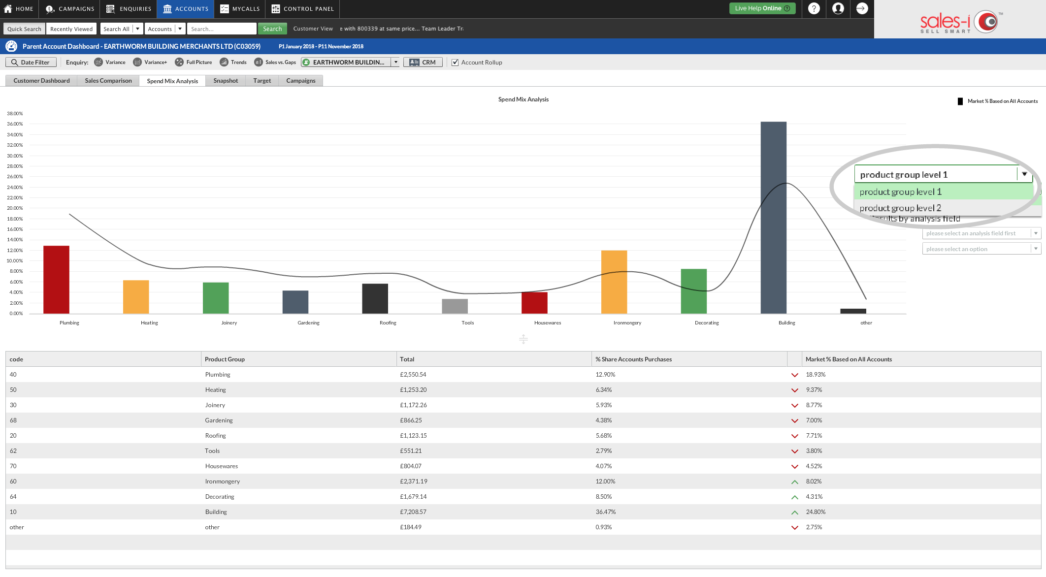
Step 5: Select a different Product Group level
By default you see Product Group Level 1 products.
To view other Product Group Levels, click the drop down options on the right hand side of the chart and select a different Product group level.
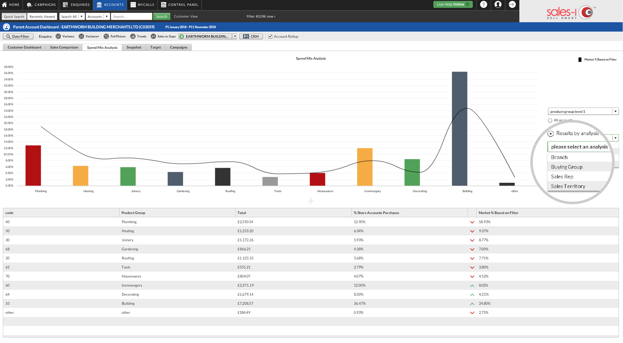
Step 6: Select a different analysis field
Your market average figure, (the line graph), is based on all of your accounts by default.
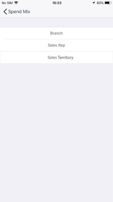
If you want to change the market average figure, for example to see the market average for these product groups based on Sales Territory, click the Results by analysis field button. This will reveal more drop down options.
These further options relate to the green customer analysis bubbles that your company has enabled. Options may include Branch, Buying Group, Sales Rep or Sales Territory.
For example, you could select Sales Territory and select Midlands to see if this company is above or below the market average compared to all companies in that territory.
Apple
Download a PDF Version
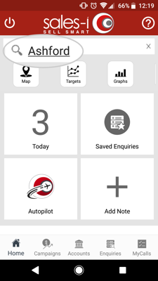
Step 1: Use the Quick Search
Use the Quick Search bar to find the account you would like to view.
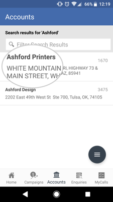
Step 2: Tap the correct account
Tap the account you would like to view.
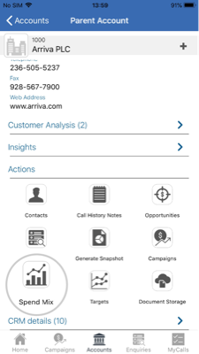
Step 3: Select Spend Mix
The company's account card will now appear showing different information about your chosen account.
To view the company's Spend Mix Analysis. Click Spend Mix under the Actions section.
Next, choose whether to select Parent Account or Customer from the options that appear.
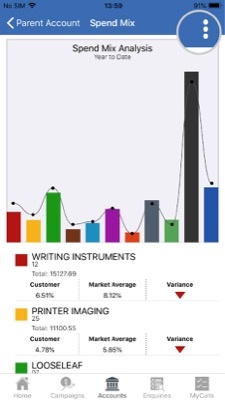
Step 4: Spend Mix Analysis explained
You will now see a Spend Mix Analysis chart and below that a table. The bar shows the amount spent YTD by your selected company on that product group. The line shows the Market Average.
Tap on a bar and the chart and the information underneath it will change to show you some information about that particular product group including:
The name of the Product Group. and the Total spent year to date.
Customer indicates the % share of their total spend YTD on that product group.
Market Average is the average of all of your accounts in sales-i that have spent money in your selected Product Group YTD.
Variance indicates whether your customer has spent above (green arrow) or below (red arrow) the Market Average, if they’ve spent below average this could be an area for your sales rep to target.
To see further options tap on the three dots icon in the top right hand side.
Step 5: Select a different Product Group level
By default you see Product Group Level 1 products.
To view other Product Group Levels, tap Product Group Level 1 and then select a different product group level.
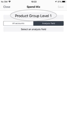
Step 6: Tap Analysis field
Your market average figure, (the line graph), is based on all of your accounts by default.
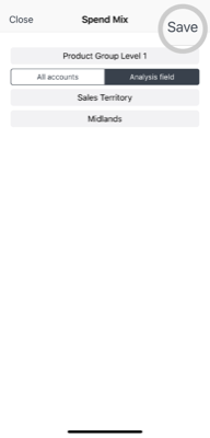
If you want to change the market average figure, for example to see the market average for these product groups based on Sales Territory, tap Analysis field and then tap Select an analysis field.
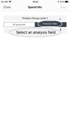
Step 7: Select an analysis field
You will now see some further analysis field,
These relate to the customer analysis bubbles that your company has enabled. Options may include Branch, Buying Group, Sales Rep or Sales Territory.
For example, you could select Sales Territory and select Midlands to see if this company is above or below the market average compared to all companies in that territory.
Step 8: Tap Save
Once you have chosen your new options tap Save in the top right hand corner.
The graph and table will update.
Android
Download a PDF version
Step 1: Use the Quick Search
Use the Quick Search bar to find the account you would like to view.
Step 2: Tap the correct account
Tap the account you would like to view.
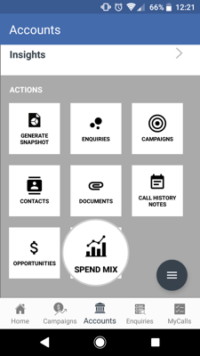
Step 3: Select Spend Mix
The company's account card will now appear showing different information about your chosen account.
To view the company's Spend Mix Analysis. Click Spend Mix under the Actions section.
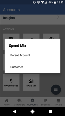
Next, choose whether to select Parent Account or Customer from the options that appear.
Step 4: Select Parent Account or Customer
Select Parent Account or Customer
Step 5: Spend Mix Analysis explained
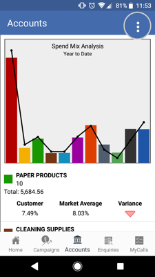
You will now see a Spend Mix Analysis chart and below that a table. The bar shows the amount spent YTD by your selected company on that product group. The line shows the Market Average.
Tap on a bar and the chart and the information underneath it will change to show you some information about that particular product group including:
The name of the Product Group. and the Total spent year to date.
Customer indicates the % share of their total spend YTD on that product group.
Market Average is the average of all of your accounts in sales-i that have spent money in your selected Product Group YTD.
Variance indicates whether your customer has spent above (green arrow) or below (red arrow) the Market Average, if they’ve spent below average this could be an area for your sales rep to target.
To see further options tap on the three dots icon in the top right hand side.
Step 6: Select a different Product Group level
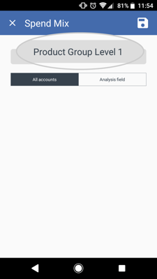
By default you see Product Group Level 1 products.
To view other Product Group Levels, tap Product Group Level 1 and then select a different product group level.
Step 7: Tap Analysis field
Your market average figure, (the line graph), is based on all of your accounts by default.
If you want to change the market average figure, for example to see the market average for these product groups based on Sales Territory, tap Analysis field and then tap Select an analysis field.
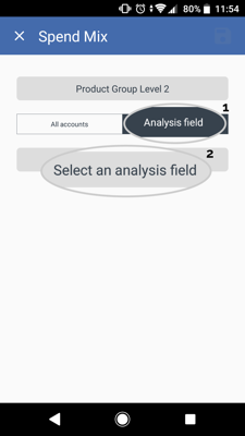
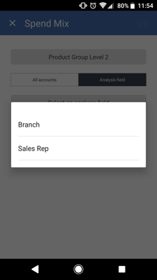
Step 8: Select an analysis field
You will now see some further analysis field,
These relate to the customer analysis bubbles that your company has enabled. Options may include Branch, Buying Group, Sales Rep or Sales Territory.
For example, you could select Sales Territory and select Midlands to see if this company is above or below the market average compared to all companies in that territory.
Step 9: Tap Save
Once you have chosen your new options tap Save in the top right hand corner.
The graph and table will update.